
Bethel School of Technology is a school unlike any other. Last year, I began my partnership with Bethel Tech as their social media manager overseeing creative and brand expression. It has been incredible to see the impact this faith-based online tech bootcamp is making in the world.
If you’ve been around Bethel Church or founder Kris Vallotton, you know that cultural transformation is central to the heartbeat of this movement. This school was established in 2017 with a heart to impact companies in Silicon Valley and equip individuals to work in the tech space. Since its origin, graduates are now employed at IBM, Dell, US Army, Ramsey Solutions, and Tailored Brands (Men’s Warehouse, Jos Banks, and KoS Sportswear).
Backstory:
When the school started, a site was built that covered the perceived needs of its first year and perspective students. As the school grew and programs expanded, we knew it was time for a fresh look to the site, covering FAQs, brand messaging for corporate partnerships, and clear calls to action for an adult education program. Launching at a conference in Dallas this summer, we landed on the following objectives:
Objectives:
- Launch at Heaven Come Dallas (with corporate partners Bethel Music) and showcase a new look for Bethel School of Technology
- Visuals that appealed to prospective students and felt different than other bootcamps within the coding space
- Vibrant, colors needed to feel more saturated as the school launches a UI/UX design program
- Feels like the “next step” for the school in its second year
- Expands on existing brand elements and colors
Process:
Unlike other projects, I have been working with Bethel School of Technology and their social media accounts over the past year. Every other week, we open up our feed for questions and encourage our audience to send DMs. Because of this, I quickly knew the downfalls of the existing website in providing prospective students and potential corporate partners information they desired.
Color:
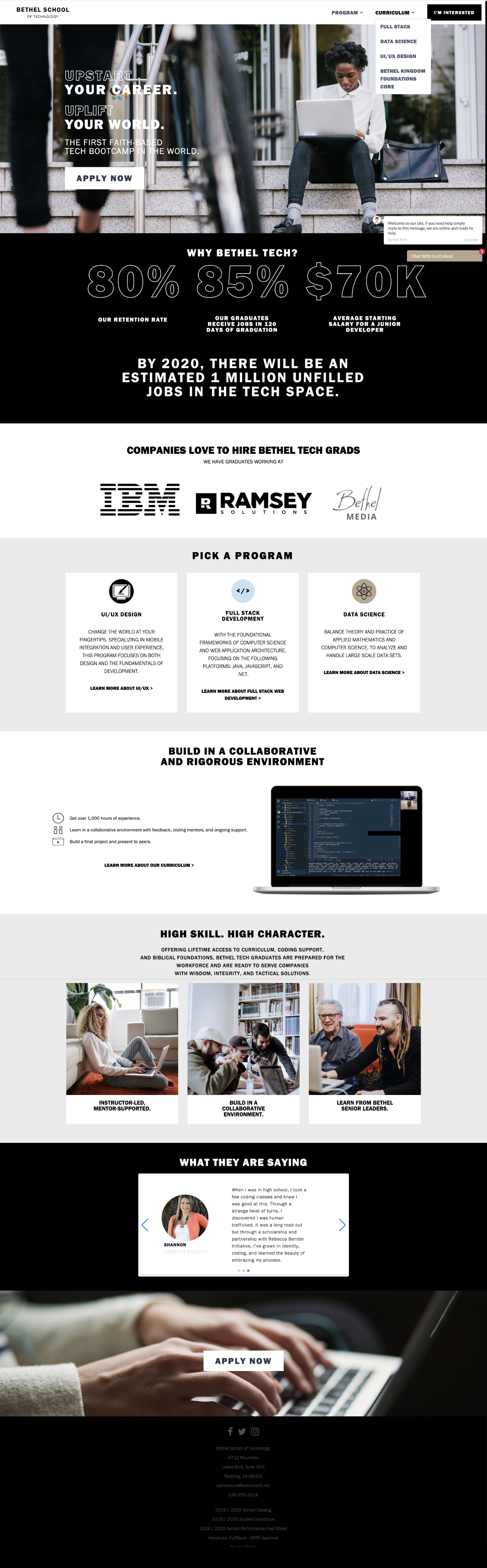
Building on an existing palette, there was one essential element to the current identity that was lacking- vivid color. Throughout the tech space there are two common lines of thought- mainly neutrals with a soft splash of desaturated color (think Apple) or the full spectrum of color (think Microsoft and Windows 10 updates). With the launch of the UI/UX Design program, an additional color needed to be added to the otherwise neutral and desaturated palette. However, it had to be the perfect shade of blue to remain cohesive. The blue we chose struck a medium ground between a cyan and cobalt, commonly used throughout the tech space and remains intuitive to the user within interactive design.
Web Design:
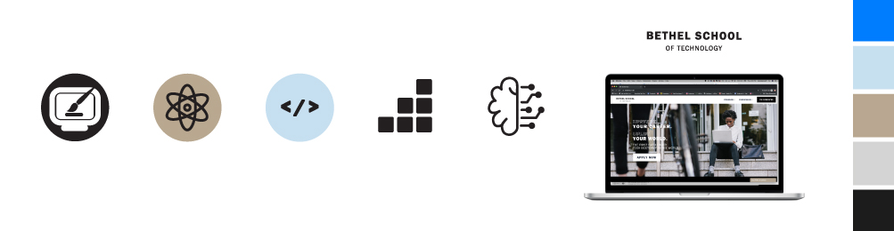
A focus on deliberate simplicity, this site was built with user empathy in mind. Knowing the needs and pain points of Bethel School of Technology’s prospective student, each page is filled with smart web copy, intuitive icons for the student, and screenflows simulating a in-class environment.
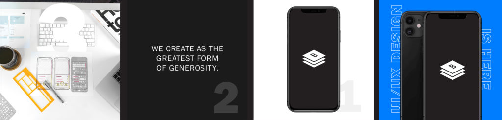
UI/UX Program Launch:
With the new site came a stacked program and campaign launch. For this launch, animation, GIFs, and video were added to generate buzz and excitement. Because the program was focused on design we played with bold colors, oversized type, and highlighting the latest in tech.
Outcome:
- Increased leads and successful start of UI/UX design program
- Data and lead tracking specific to live in-person events
- A brand to that is innovative and forward facing for a tech school
“Glisten and Grace crushed it on the creative for our UI/UX program and our site redesign.”
– RYAN COLLINS, CEO of Bethel School of Technology
Web Design:
UI/UX Launch Social Assets:
Icon Set:
![]()