Rebecca Bender is an activist, award-winner social entrepreneur, and human trafficking survivor. Over the past 10 years, Rebecca has built an non-profit, published multiple books, and traveled the nation bringing awareness to the issue of human trafficking and offering practical education and tools for survivors.
As soon as you encounter Rebecca or follow her on social media, you know Rebecca is full of energy, has a big personality that lights up a room, yet hasn’t forgotten where she comes from (not to mention, she’s hysterical).
I began working with Rebecca and her team in May of 2019 and the months have absolutely flown by. In that time I have designed her new identity, planned strategy for the organization’s pivot, podcast art, graphics, email opt-ins, email campaigns, merchandise, and website.
Backstory:
Rebecca had a well-established branding for her non-profit. The only problem? The non-profit was ready to go in a new direction. With the upcoming release of memoir for 2020 and additional media outlets, there needed to be a clear visual detour with the new direction. Rebecca had a fresh challenge- she needed a visual identity that would feel distinct as the non-profit grew to encompass far more than before. Because of this, we landed on the following objective.
Objectives:
– Kick off Fall 2019 with a new look for the Hood to Holy Podcast
– Visuals that felt true to Rebecca with a different look and feel than what existed in mainstream Christian media (namely women’s ministry)
– Vibrant and memorable
– Feels like the “next step and expansion” of the non-profit
– Expands on existing brand elements, colors, while feeling distinct
Process:
The first step in my process was to thoroughly review the existing website and identity. What worked and what didn’t? What felt slightly dated? What products were selling in the shop and what wasn’t? Outside of loving the non-profit’s mission and vision, we had a clear direction for the ways Rebecca wanted to grow and position herself as well as a speaker on topics other than human trafficking. This guided the brand messaging and strategy throughout the rebrand, informing copy and feel throughout the site.
Color:
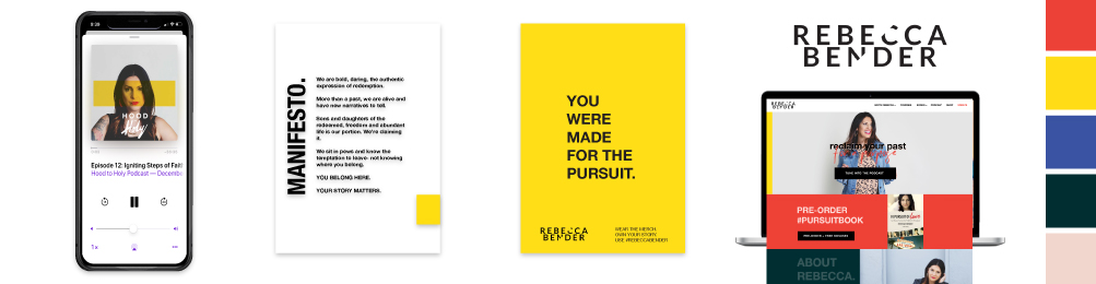
After the initial audit, I moved onto creating the color palette. Making tweaks to the Rebecca Bender palette, these choices are bold and lean into the psychology of color. Attention grabbing and exuding passion, we chose colors of bright reds, yellows as the focus for the podcast. Playing off of these colors on the website, we added a soft light gray with a blue base, rich cobalt, hunter green, and soft pink. The result is a cohesive palette with color choices that have stunning contrast, regardless of the pairing.
Typography:
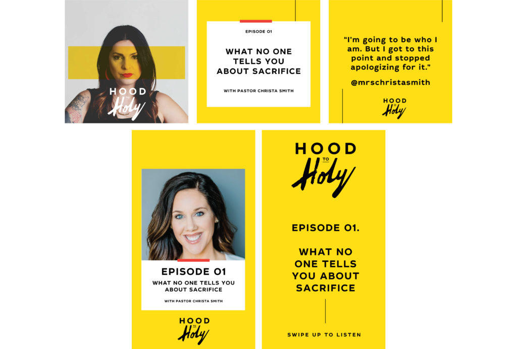
Playing with the level of edge and idea of urban street culture, this identity is filled with type choice that feel current and on-trend. From the use of Helvetica, to the thoughtful use of brush and display fonts, it offers the breadth needed for readable and web applications while remaining playful, capturing the attention of the audience. For podcast art, type choices truly can make or break the engagement of an audience. On the podcast art, we played with directional line and the use of brush type juxtaposed with a simple sans-serif. The result a moment of cover art that immediately captures your attention and stands out from the crowd.
Web Design:
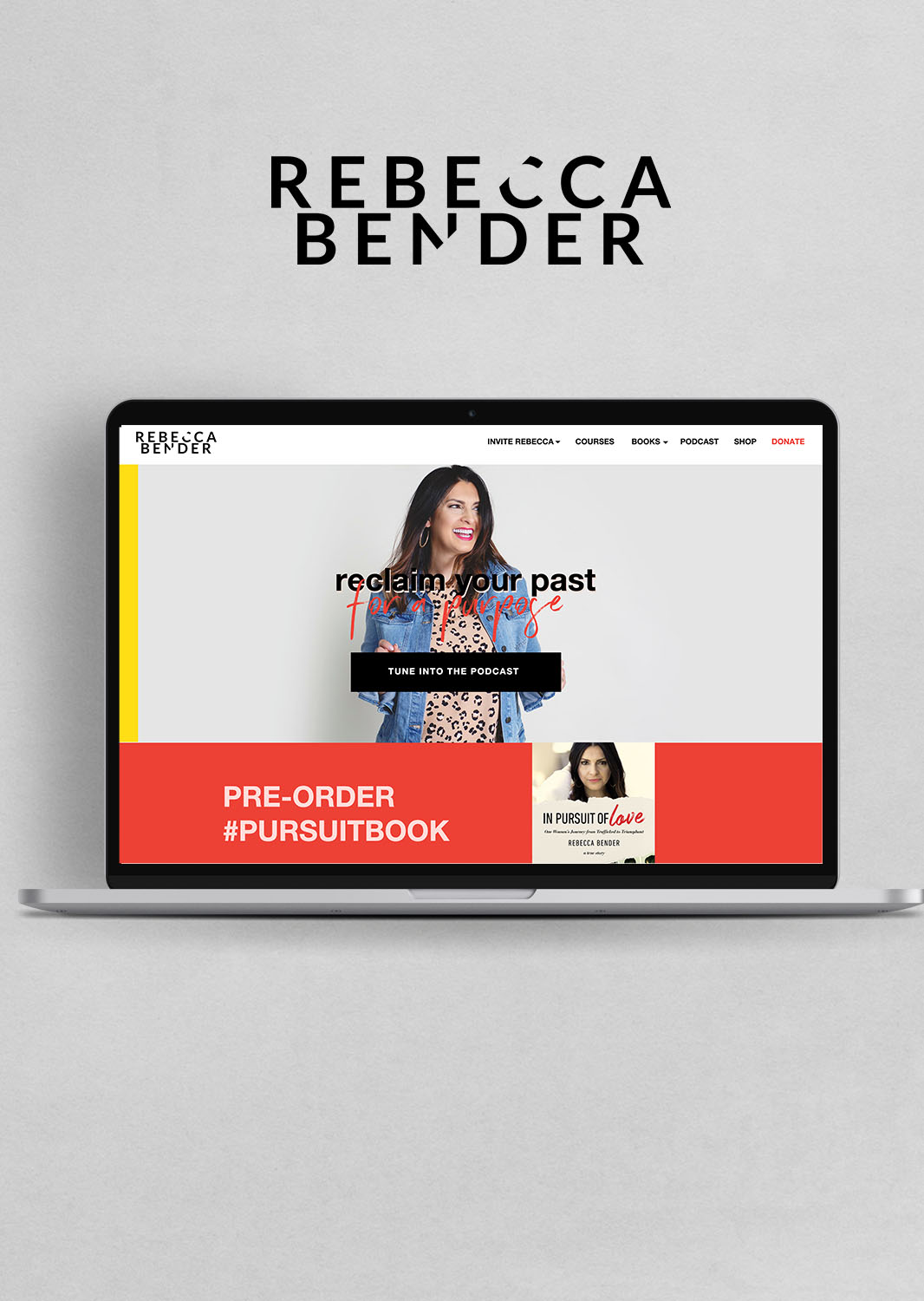
After the initial logo, colors, podcast art, and typography were set we headed into web design. This site is somewhat complex with integrated courses, shop, multiple email lists, customer portal, and freebies embedded throughout. For ease of changes for Rebecca’s team, the front-end is built on ShowIt 5 whereas the backend includes a customized WordPress store powered by Woocommerce. Throughout the following year, homepage headers will be changed based on the launch season and current offerings. To keep the site dynamic, the podcast has its own landing page with updated shownotes, resources, and freebies within each episode.
Templates:
As the site was completed, our team focused on shifting to social media graphics and templates. With a use of a bold block of yellow, the podcast stands out from the crowd on social with a smart use of carousel images with every episode. Every week there are 8 assets to build out from Instagram feed, Instagram Stories, and show notes.
Outcome:
I am thrilled with how this project came together – this was an identity of high collaboration and a high value. We gathered feedback from the team that shaped how this site functions and garners results every day. Ultimately I believe we met our objects and were able to kick off October 2019 of the Hood to Holy Podcast and pre-orders for Rebecca’s memoir, In Pursuit of Love. It was a privilege to take on a project of such tremendous scope and rebrand with such an impactful and timeless mission. I’m so thankful for the way Hood to Holy podcast has already impacted thousands and the ways this content will continue to transform lives for years to come.
“Melissa nailed the branding and identity. She has a real gift for design and aesthetic and helping people find their brand identity that fits them. I love our new look.” – Rebecca Bender
Identity and Collateral:
Web Design:

Podcast Cover Art and Social Graphics