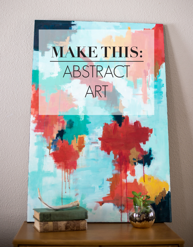
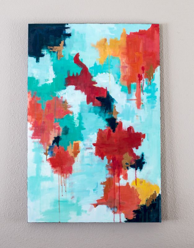
As a follow up to my acrylic painting post, I thought I’d share with you a recent abstract painting I completed. To be perfectly honest, my experience in abstract work has been very limited, and usually restricted to being 3-D in art form. It was fun to play with texture, stroke, and form within this piece. This canvas is going to be hung as a large scale dominant piece, over a sofa, placed on a neutral wall. I chose my color scheme of my painting based upon some of the colors and metallics being used in other areas in the room.
Keep reading to find out how to make your own!
Step one: Find some good inspiration to be the driving force for your masterpiece.
After doing a bit of research for some solid inspiration, I was inspired by the work of Belinda Marshall, One Mans Trash, and Michelle Armas. I loved the light and airy feelings these pieced evoked, while still have an intentional use of stroke, repeated form, and texture.

Step two: Select your color palette. Limit it to 2-4 dominant colors.
I found myself inspired by a range of emotions and wanting to use a bright and cheerful color palette. I chose a few colors to ground the piece and make it cohesive. I narrowed my choices to green, yellow, coral, and copper.
Step three: Gather your supplies and lay in your base colors.
Supplies:
- Paper palette
- Basic acrylic colors
- Copper gold leaf paint
- Medium round brush
- Palette knife
- 24 x 36 inch wrapped canvas
When painting your base colors remember it doesn’t have to be perfect. My canvas was rather large in scale, 24 x 36 inches, so I wanted to use broad strokes of color. In your base colors limit your moments of emphasis. This will make create a pleasing composition, movement, and unity throughout the work.

Step four: Add in texture and simplify your strokes.
When I placed my base colors on the painting, I realized I had gone a bit more darker and detailed, branching out of my color scheme too much. I fixed this by brightening my colors, adding the necessary amount of white to the piece, and creating larger shapes of color. Using water, I created watered down glazes, playing with drips and splatter on the piece. Using a palette knife I made broad strokes of texture, adding dimension and form to the work. Placing the copper foil paint next to the deep emerald, created lovely contrast and some needed iridescence.

Step five: Step back from the piece. Do you like it?
This is always an important step as an artist. The experienced artist knows when to step back from a painting and evaluate it. Does the painting speak to you? Does it express an emotion? What is it missing? Are there moments you really like? Are there moments you loathe? What does it need? Let your painting do the talking. Listen and adjust.
Step six: Are you pleased and happy? Should it head to the Met? If so, paint out the edges.
There’s something about white edges on a canvas that makes it feel unfinished. Make sure you paint your edges. You could wrap your colors around the edge as you paint, pick a dominant dark hue from your piece, or go with black. With this painting I opted to use emerald green on the edges.
Congratulations! You are an artist!
Inspiration image sources: Belinda Marshall | Michelle Armas | Maurice Golotta