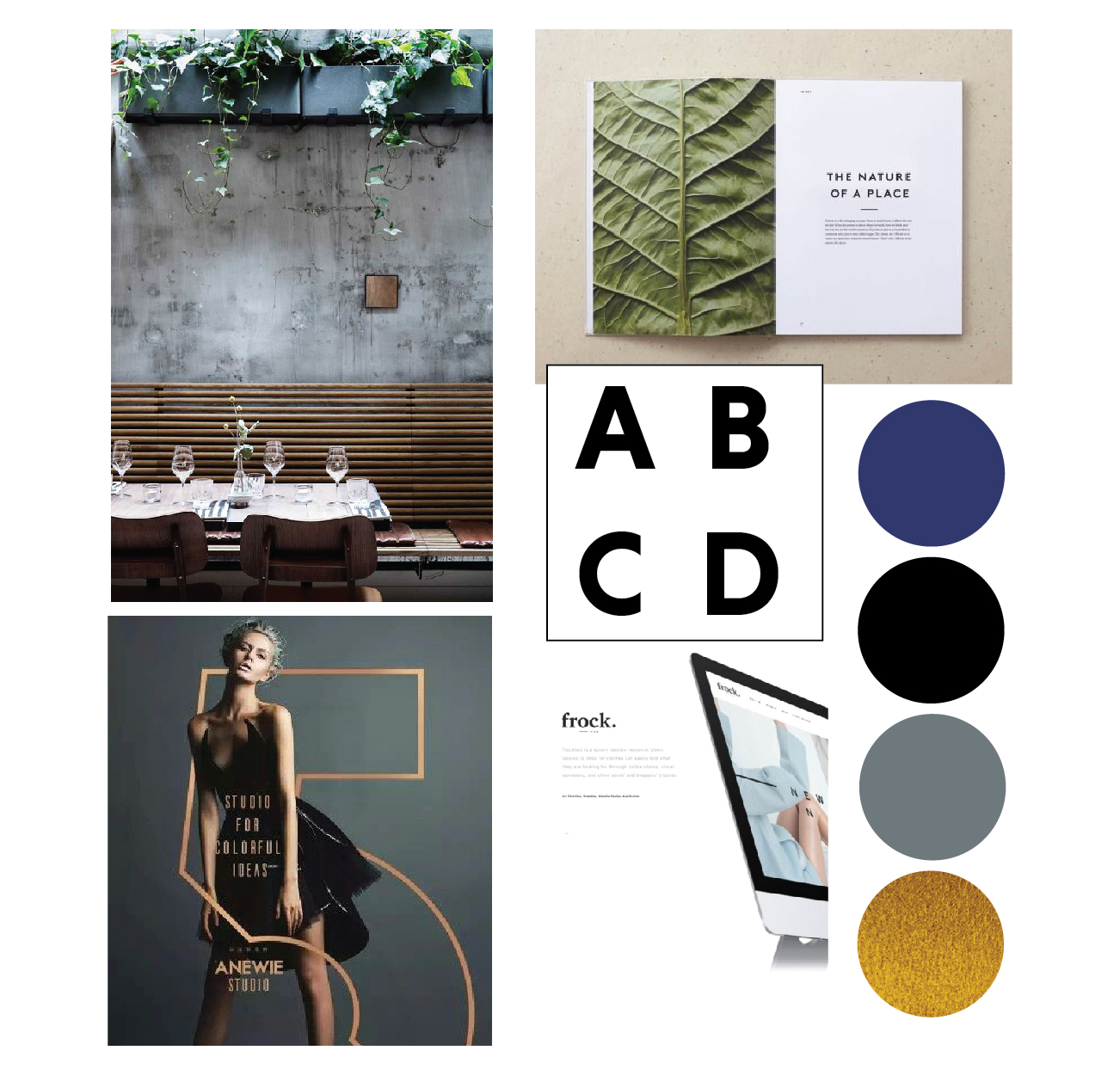
With a fresh and minimal vibe, we knew we wanted the branding for WORK to be excellent and much like it’s name, concise. This project had a strong focus on typography and type contrast throughout. While the mark was going to remain clean and robust, we still wanted a bold statement. The color scheme consisted of a moody blue, black, and pops of gold. These colors were fleshed out and came to life through the finishes in the interior.
Keep reading for the full set of work!
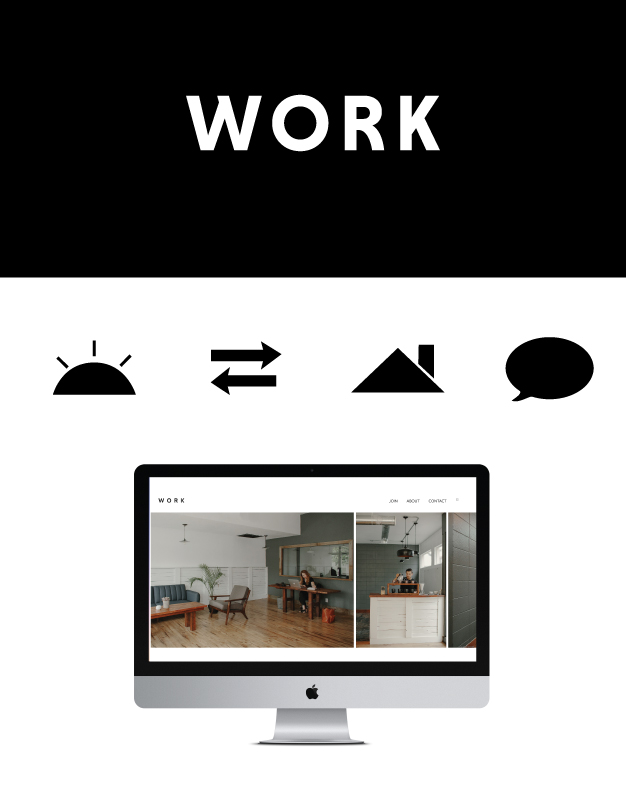
Hours were spent finding the right type contrast. In the end we went with two customized versions of a font family. It keeps the look sleek, while maintaining a bold statement. There was a president of negative space, balance, and weight. My favorite part of the logo is it’s versatility. Regardless of the application it looks great. (We have more collateral rolling out at the end of this week that I’ll be sharing on Instagram. Stay tuned.) For the body text on the website, we went with a narrow serif font in a slight italic that has minimal weight variation throughout.
The website remained image driven and was followed up by the use of icons. With the site, we knew we wanted various levels of pricing for people to join the space. Our icons played off the brand name and we integrated in each level of membership. Keeping the color scheme neutral, allowed the type and icons to send clear information without becoming overly complicated.
If you haven’t checked out the website yet, please do so at comeworkredding.com.
Looking for a designer for a project! I’m currently taking on new clients. Contact me with any of your design needs here.
This is nice! x
http://jessicawoods.fr/blog/
Thank you so much Jessica!