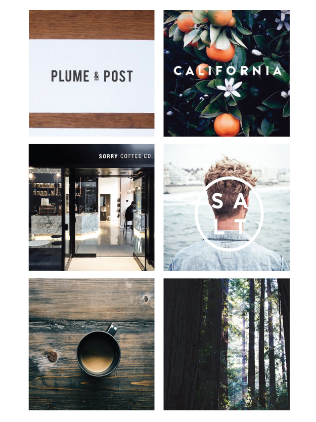
The latest edition to the portfolio is an ongoing project. This identity will carry to the client’s website, printed materials, and social media strategy. I met Mike and Sue on a Sunday morning. A lovely couple who team together in business and ministry. What started as happenstance has evolved into a beautiful journey, the ebb and flow of updating timeless truth and bringing with it classic design. A non-profit and ministry based out of Redding, CA, coupling encountering God through the timeless message of scripture. With a moodboard full of natural tones, pops of blue, and texture, we knew we were on the same page as I began to develop the mark.
Keep reading for the finished product after the jump!
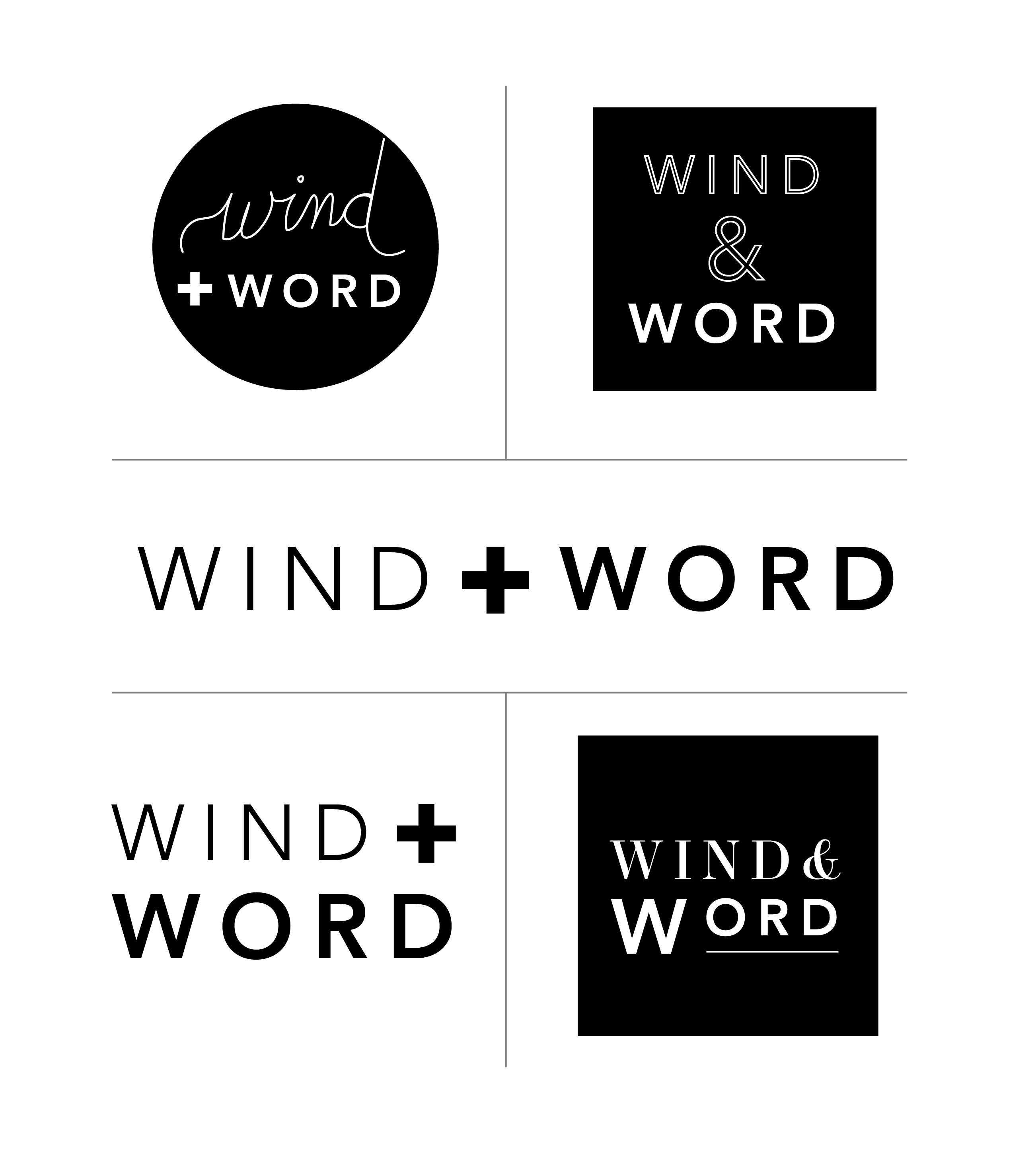
How do you say wind and word in concept rather than in literal terms? Our concept focused on movement, cohesion within the mark, and smart type contrast. Playing with fonts, a focus on ampersand treatment, and intentional use of a grid were high priorities within this mark. While developing the logo, we took note of how the mark would be used across multiple platforms, from print to social media to web.
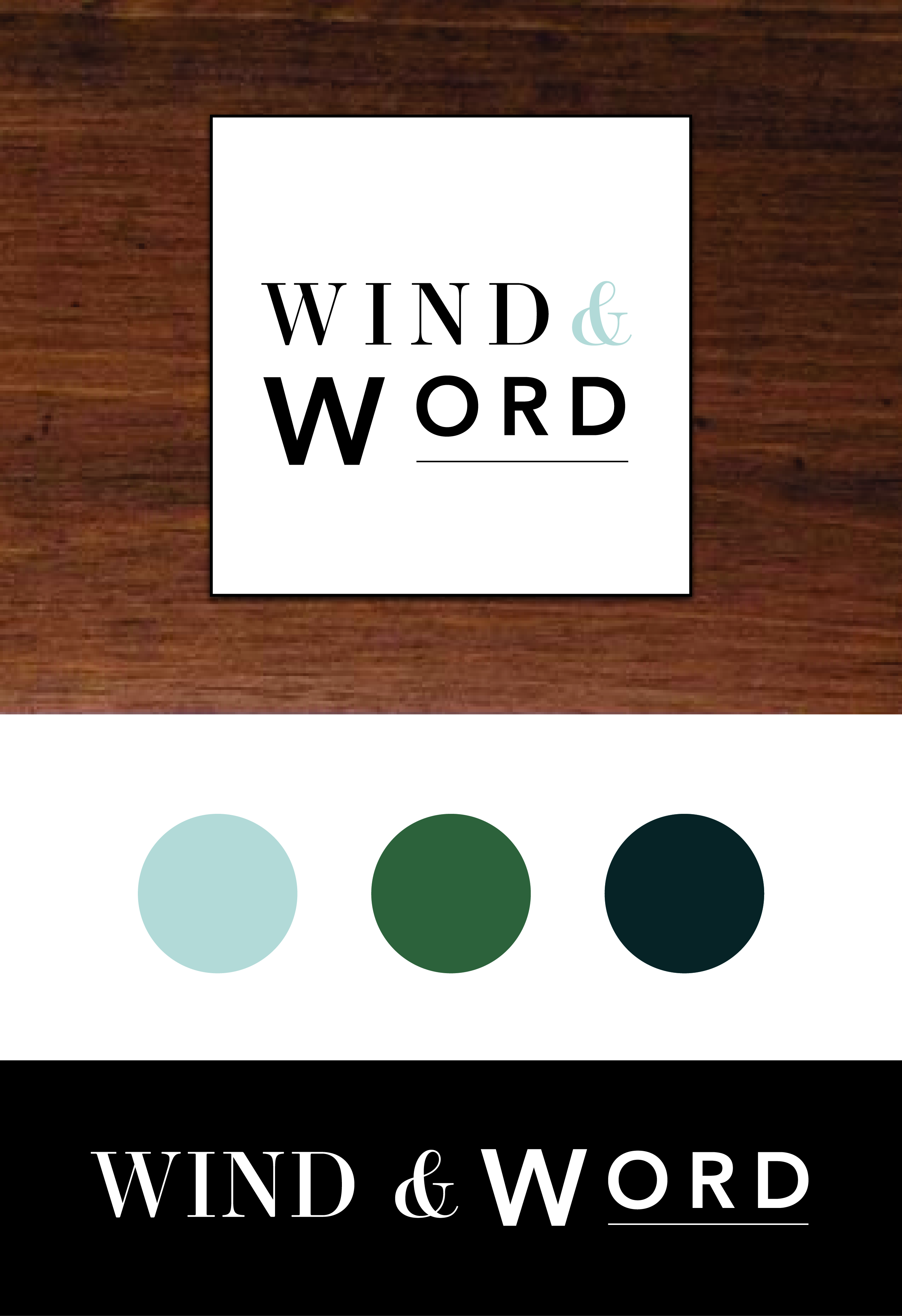
With everything approved, we’re moving onto the collateral for this rollout. Knowing our alternate marks and textures are set, I’m excited to see the applications unfold as time goes on. My favorite part of seeing every project? When all the pieces are placed together on the web. Next stop? Manual redesigns, book covers, and book layouts.
Like what you see? I’m currently onboarding clients for the remainder of the year. Contact me here and let’s get started on your project!