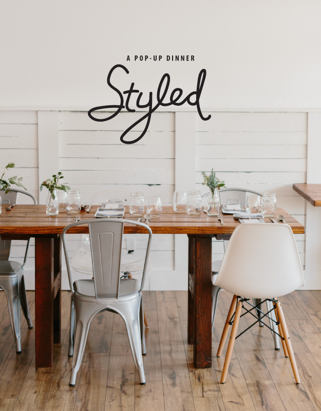
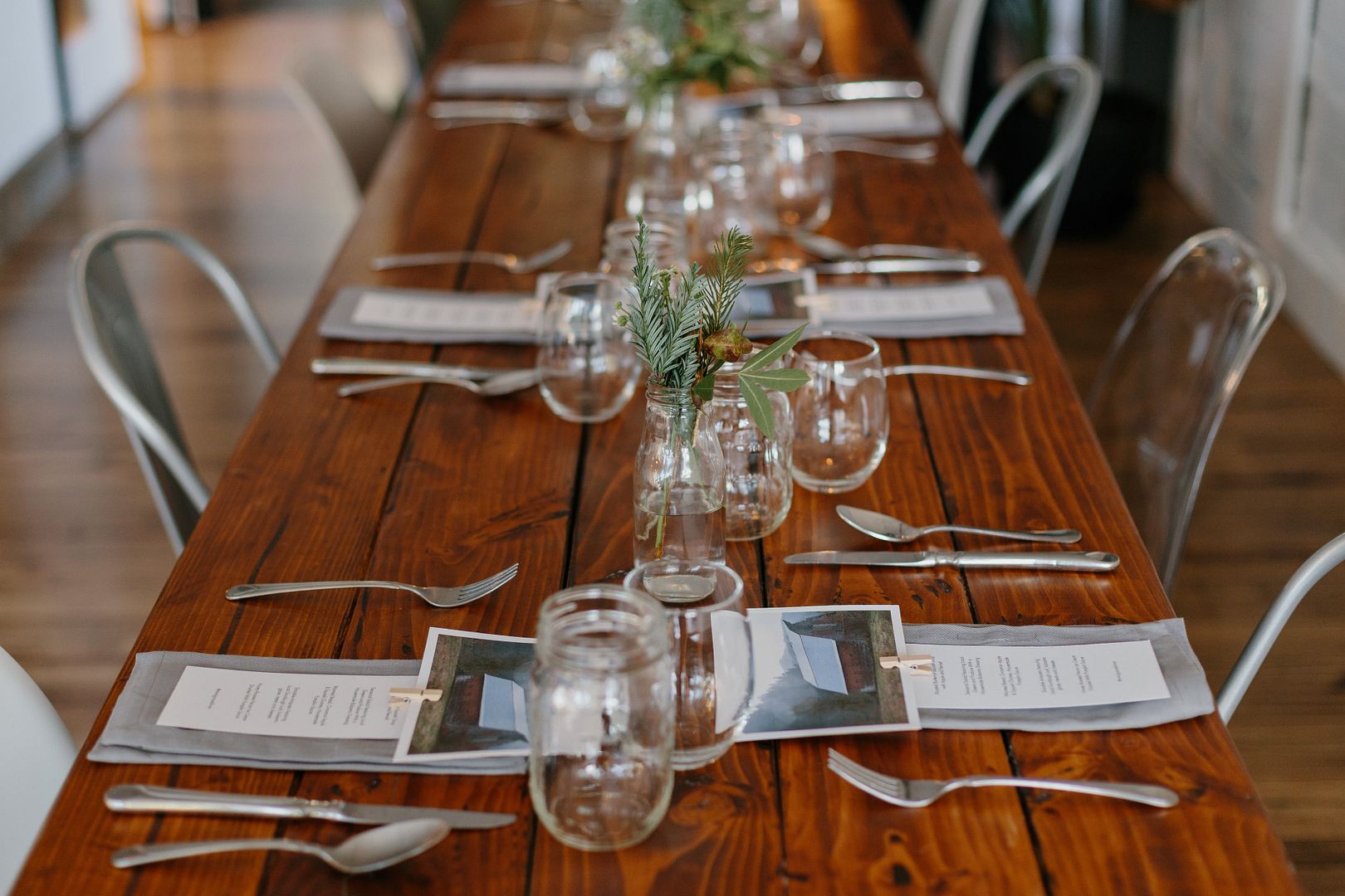
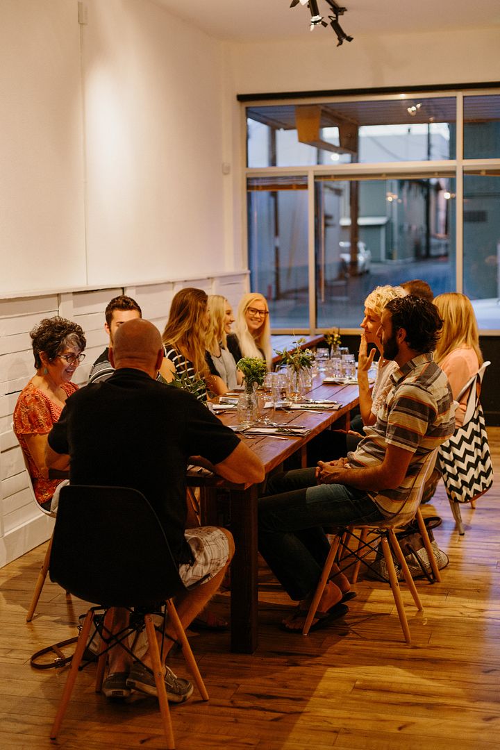
As I shared a bit yesterday, I wanted to give you the full details of the pop-up dinner I was able to style last week. Modern farmhouse was the vibe and I think we achieved it perfectly. (Without any burlap.) Using foraged greenery, simple white plates, and gray napkins, we kept the evening approachable and focused on the food, community, and supporting an amazing local business.
Keep reading for all the event details after the jump!
The Flowers
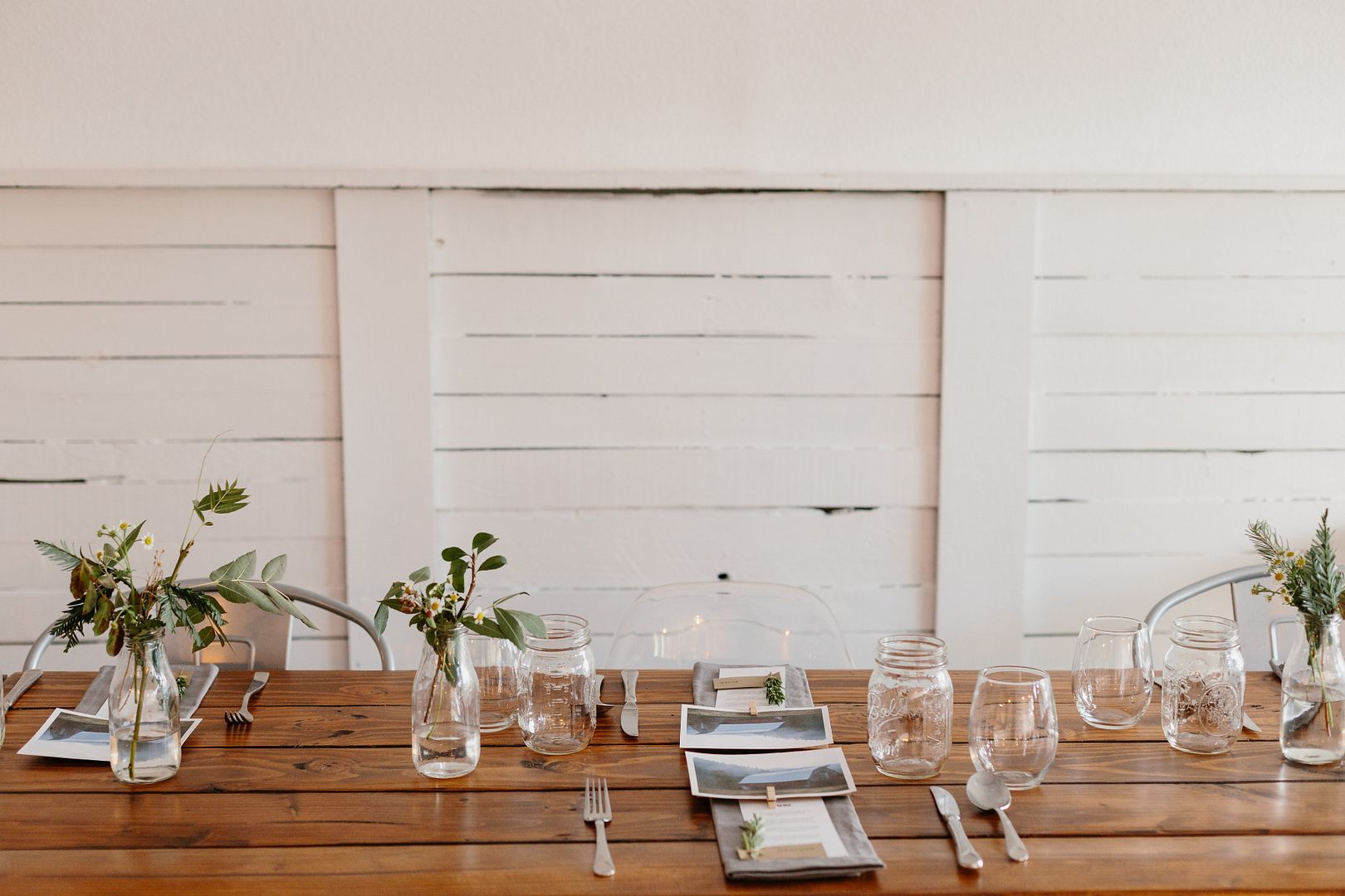
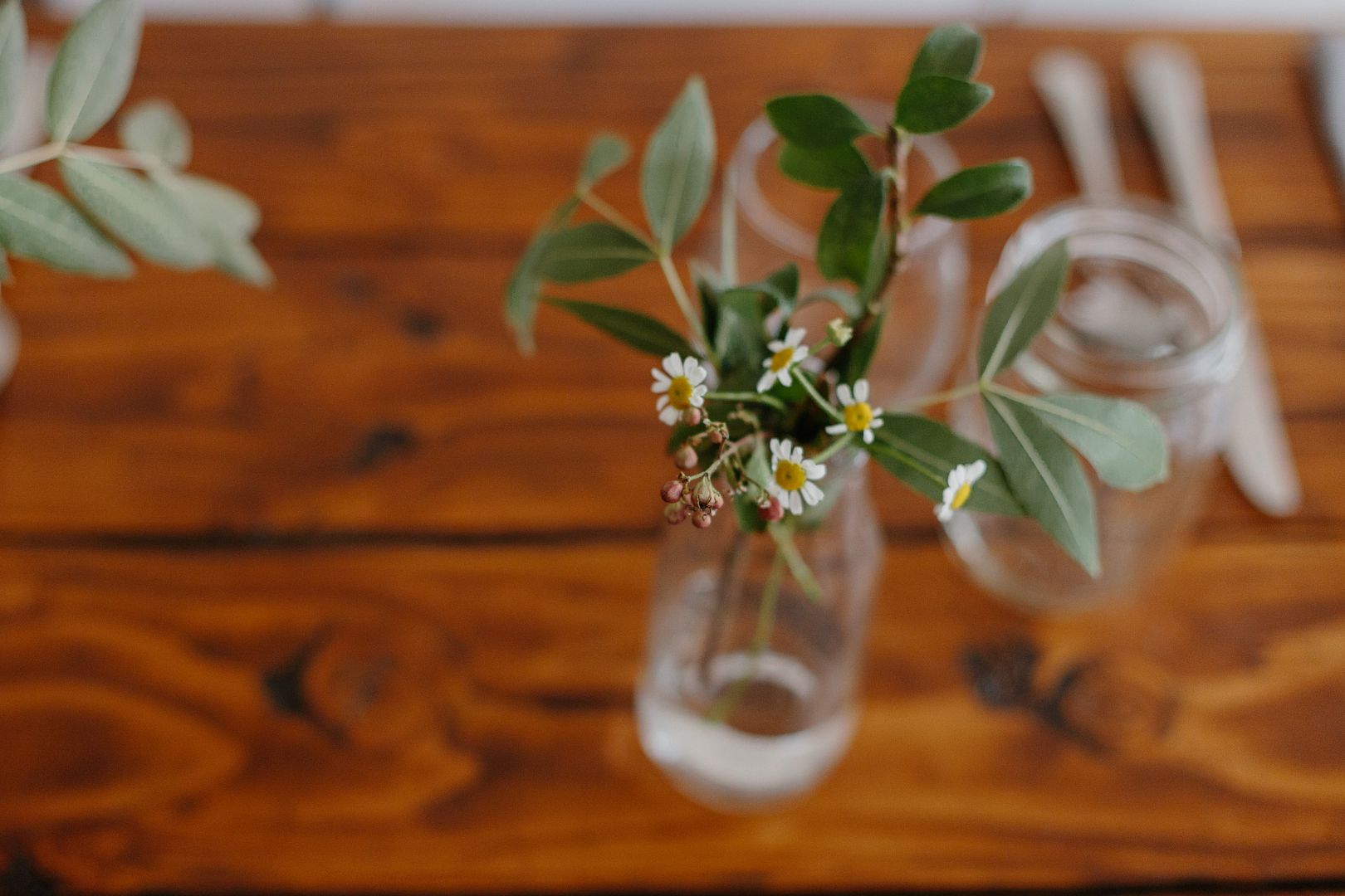
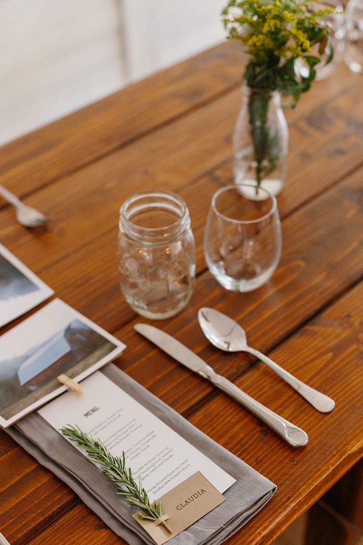
For this dinner we wanted the feel to being informal, focusing on the menu and gathering people around a common table. This will be the feel of the restaurant and one that needed to carry throughout the evening. Using glass milk jars, sprigs of autumn leaves, and branches of juniper pine, we filled out the mouth of jars with small daisy wildflower blooms.

The Food
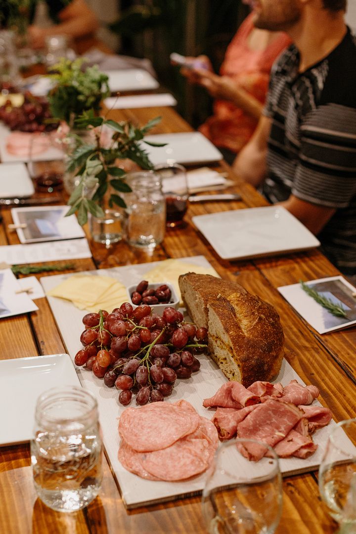
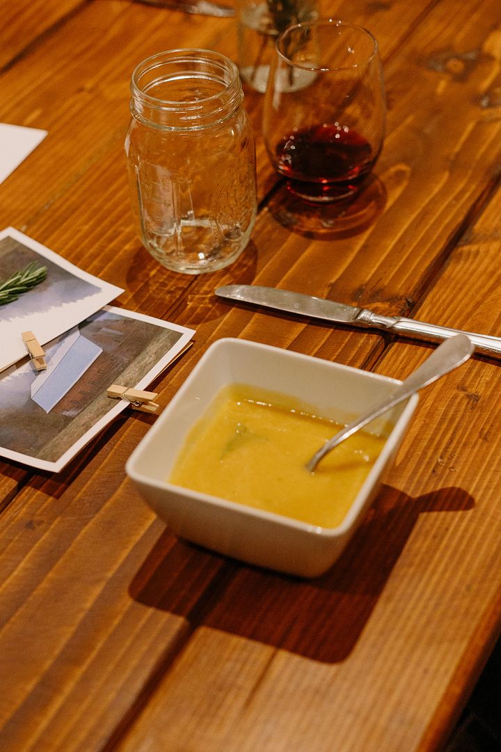
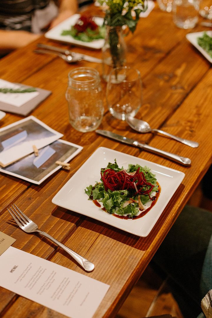
Made by Mimi Grace, I was amazed at the quality of food they were able to pull off without a full service kitchen on-s9te. This menu was inspired by flavors of autumn and smart combinations of food. With a strong food philosophy, highlighting farm-to-local and organic fare, Mimi Grace is bringing something new (and much needed) to Redding. The first course was a butternut squash soup made with chicken broth base that had been slow cooked for hours on the stove. It was my favorite dish of the evening, with a depth of flavor and soul, that you could tell in every bite. Other menu items for the evening were a roasted butternut squash and apple chutney on toasted crostini, seasonal salad, and a sharable antipasto platter. Served on large wood tiles, we chose a lighter griege (combination of gray and beige) shade to contrast with the wood tables. This sharable platter will be unique menu item and embodies the idea of sharing food with friends around the table. The other great part about the tile platters? They picked up the gray tone in the cloth napkins, allowing for the eye to travel throughout the tablescape.
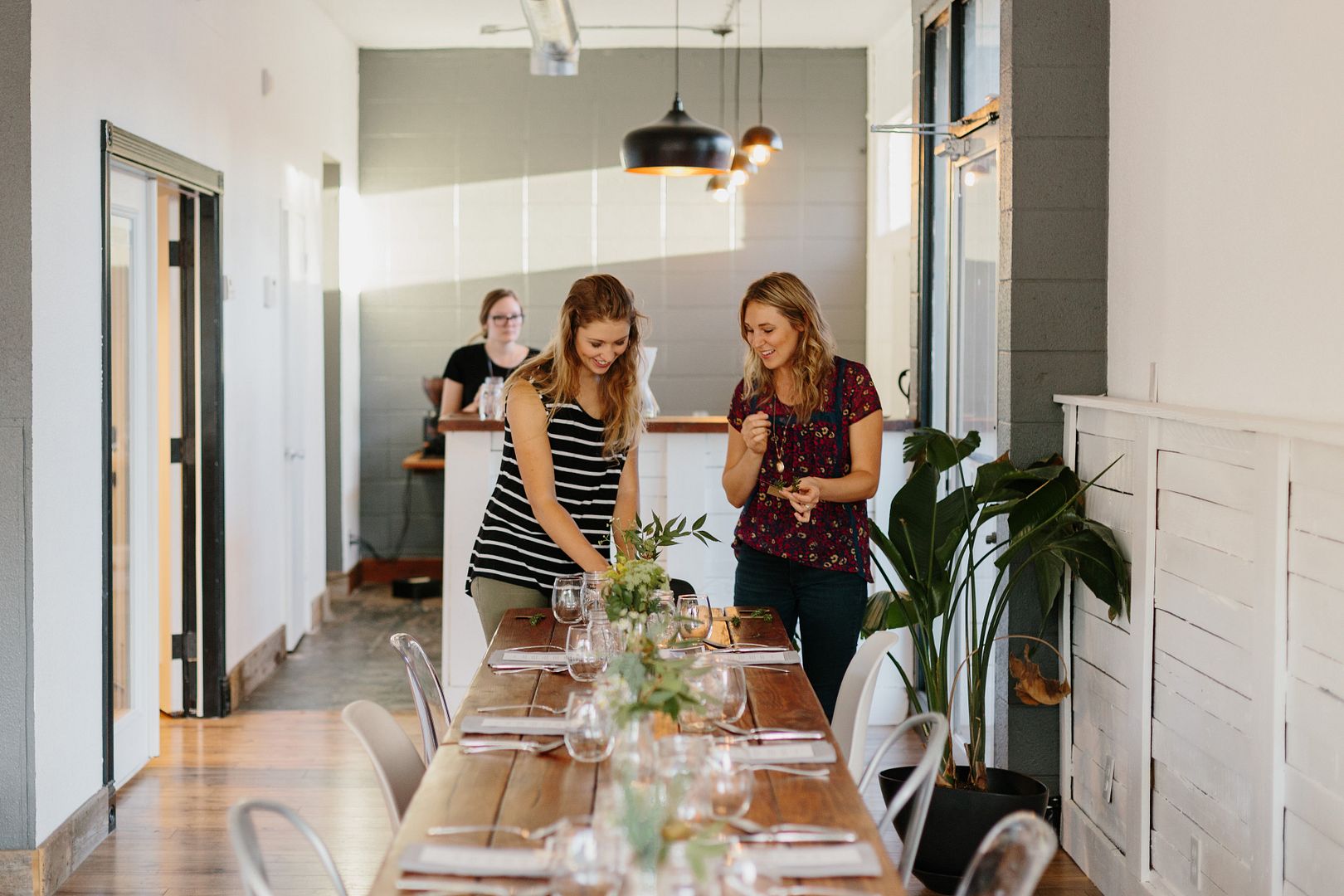
The Table
Each place setting was anchored by a few paper items that conveyed the message and purpose behind the dinner (you can read the full post about it here). To incorporate a bit more color, we added a fresh sprig of greenery to each place setting. Here’s a great tip. When setting a table think about alignment and margins of negative space. This small detail makes all the difference. Take the time to think about the placement, angles, and level nature of each item. It keeps things looking phenomenal regardless of how simple your place setting may be. To finish of our paper items, we added the simple detail of miniature wooden clothespin. Placed at the top of each place setting, it gave a strong finish and a pop of color.
Images by Sidney Morgan
Have an event that needs styling or design? Contact me here.