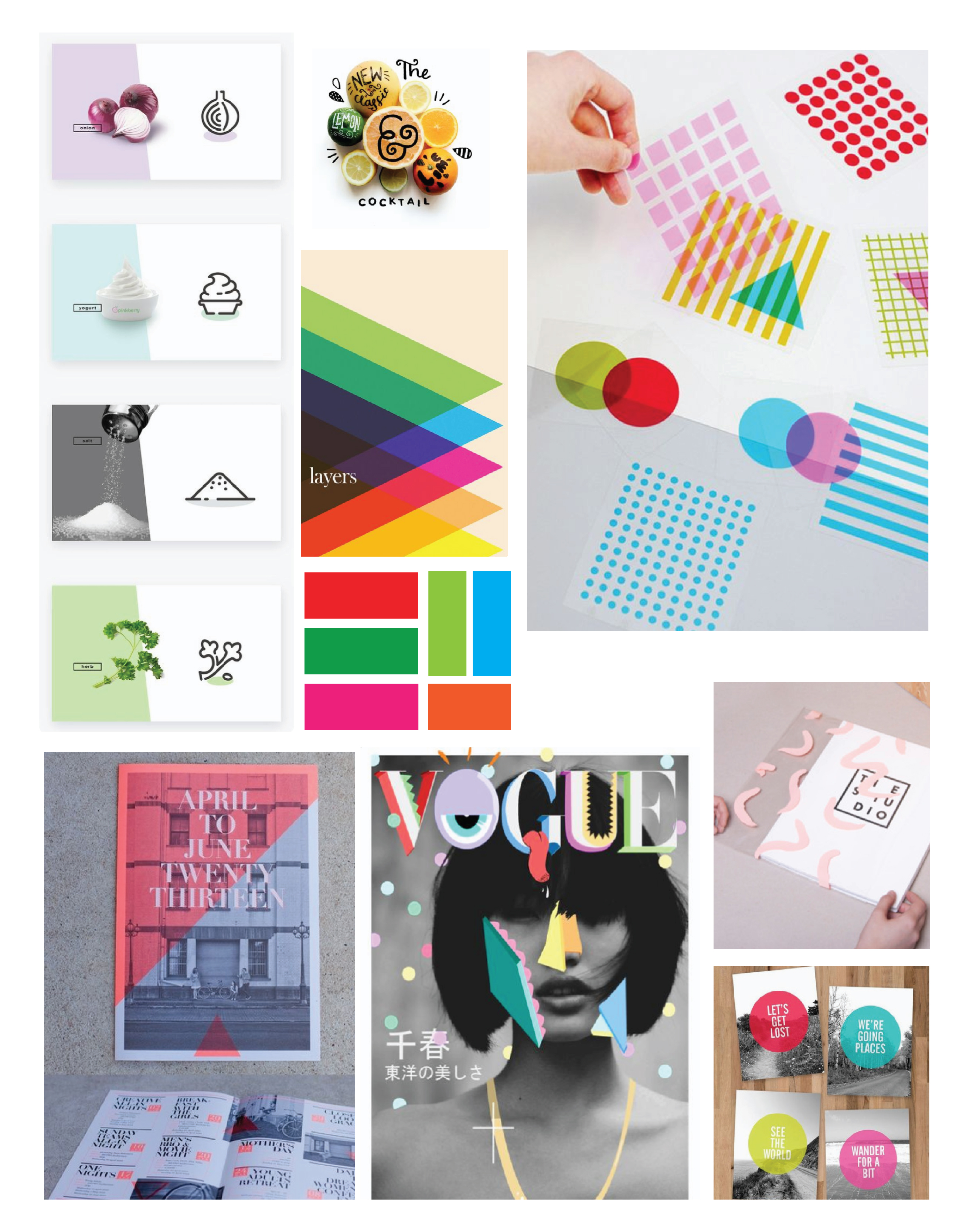
Is it possible to play with primary color in a mood board and feel something other than basic or childish? We love this moodboard for that very reason. Recently built for a client, it determines the direction of their social media and collateral. Playing with transparency and angles, a strong sense of geometric and illustration, it highlights the movement of the product in use.
Make sure to check back tomorrow as we share all the new work this moodboard has inspired!